Bread and Butter Takeout is an order-ahead takeout service that houses a wide variety of restaurants for ordering services. It is aimed towards busy students and workers who make need a quick and easy way to get lunch without taking too much time out of their day.
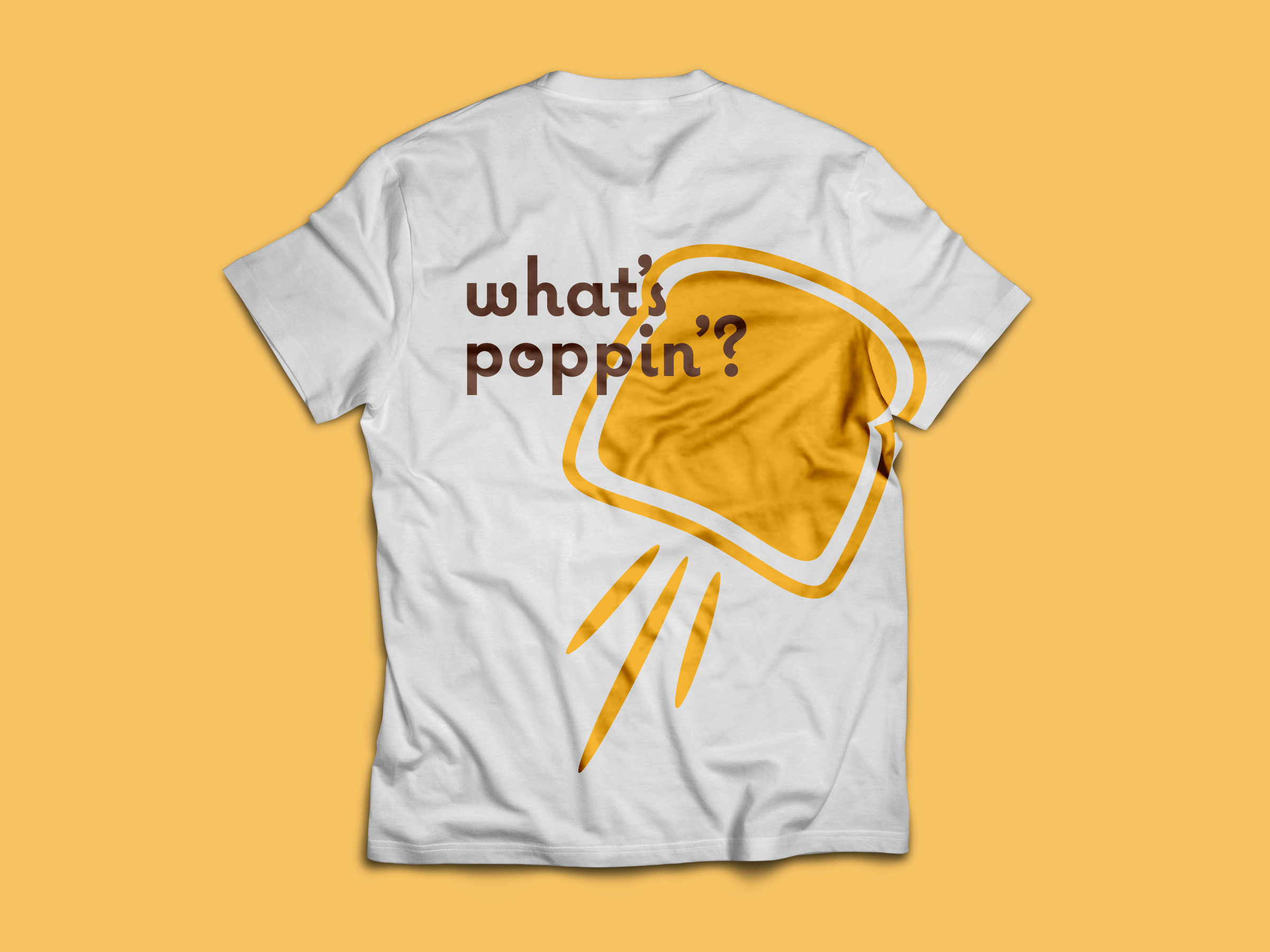
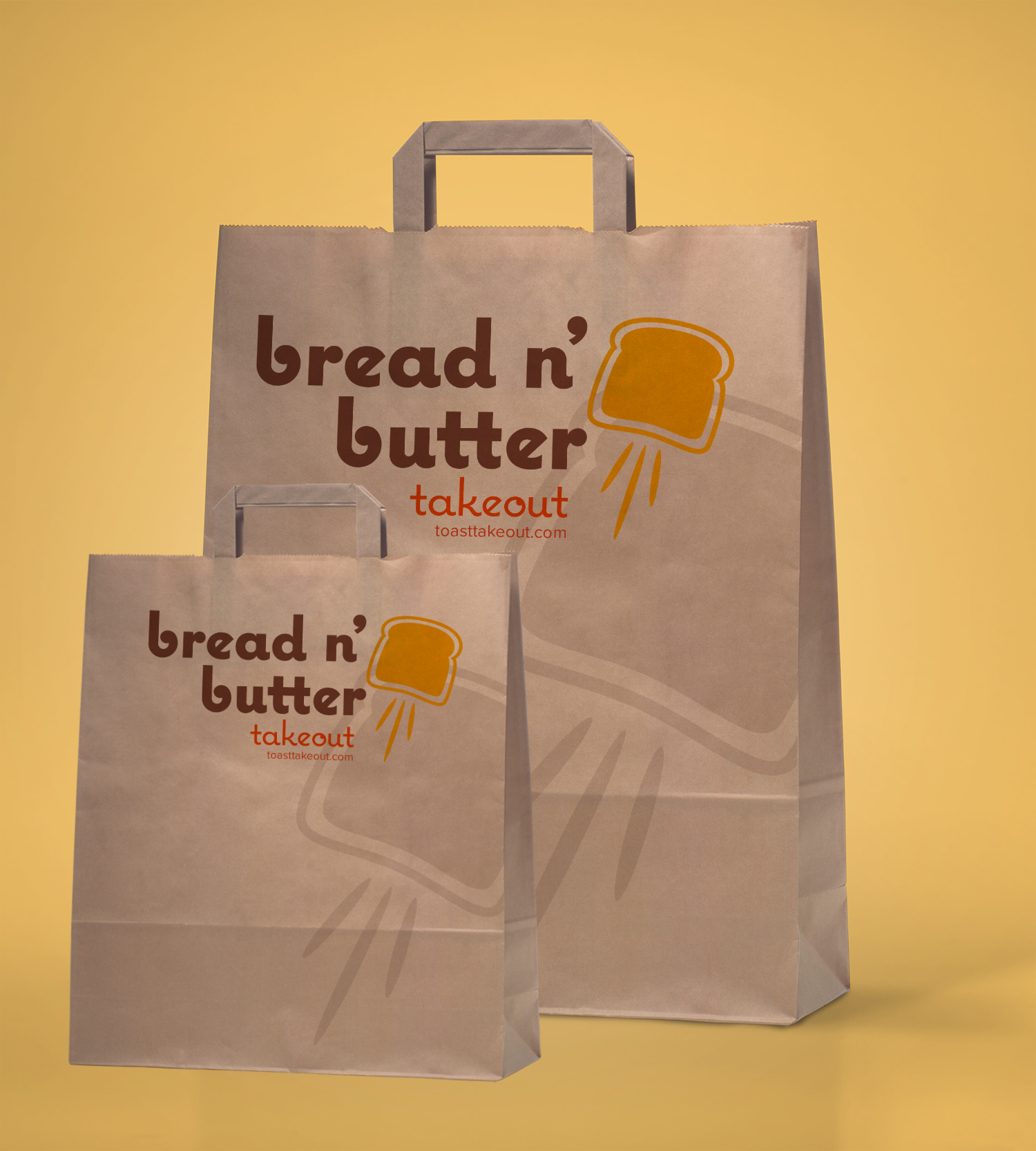
The branding for Bread and Butter is inspired by the simplest and quickest meal of all, toast! The brand mark depicts a piece of toast literally springing out of the toaster. The movement of the shape is meant to represent the quickness of the services. The color pallete represents the color scheme of toast, with a buttery yellow, a toasted brown and a marmalade orange. See a more in depth look at the Brand Guidelines.
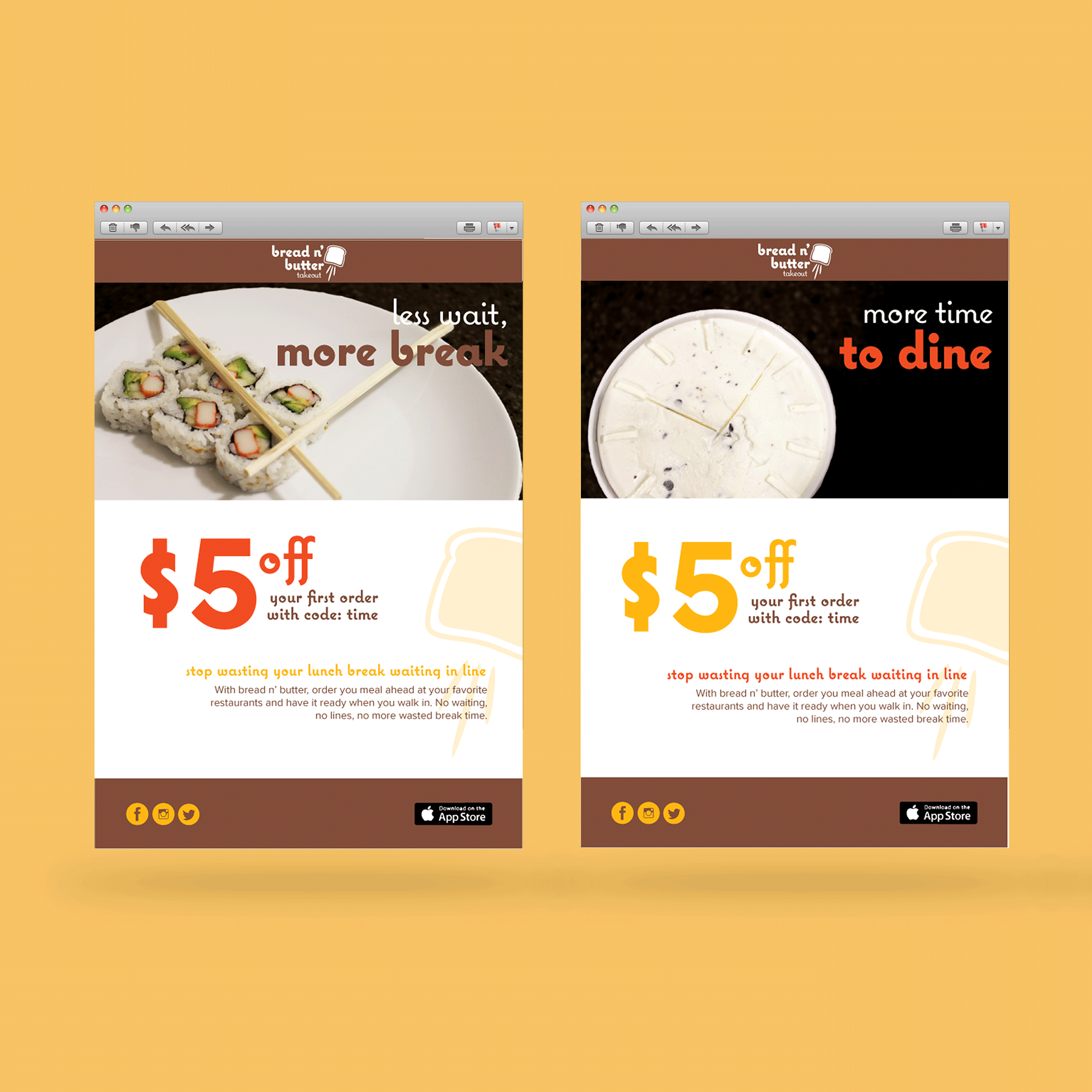
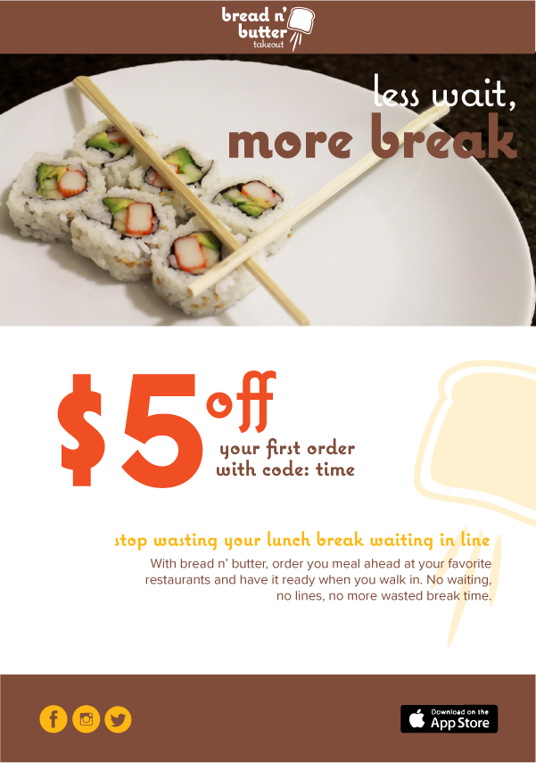
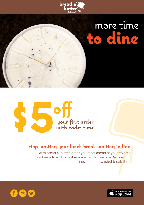
An advertisment campaign for Bread and Butter Takeout is complete with print and email advertisements centering around saving time, with imagery marrying food and clock-like shapes.
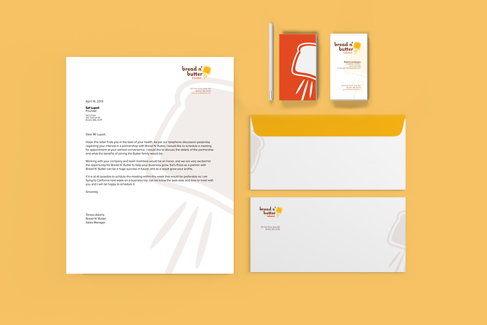
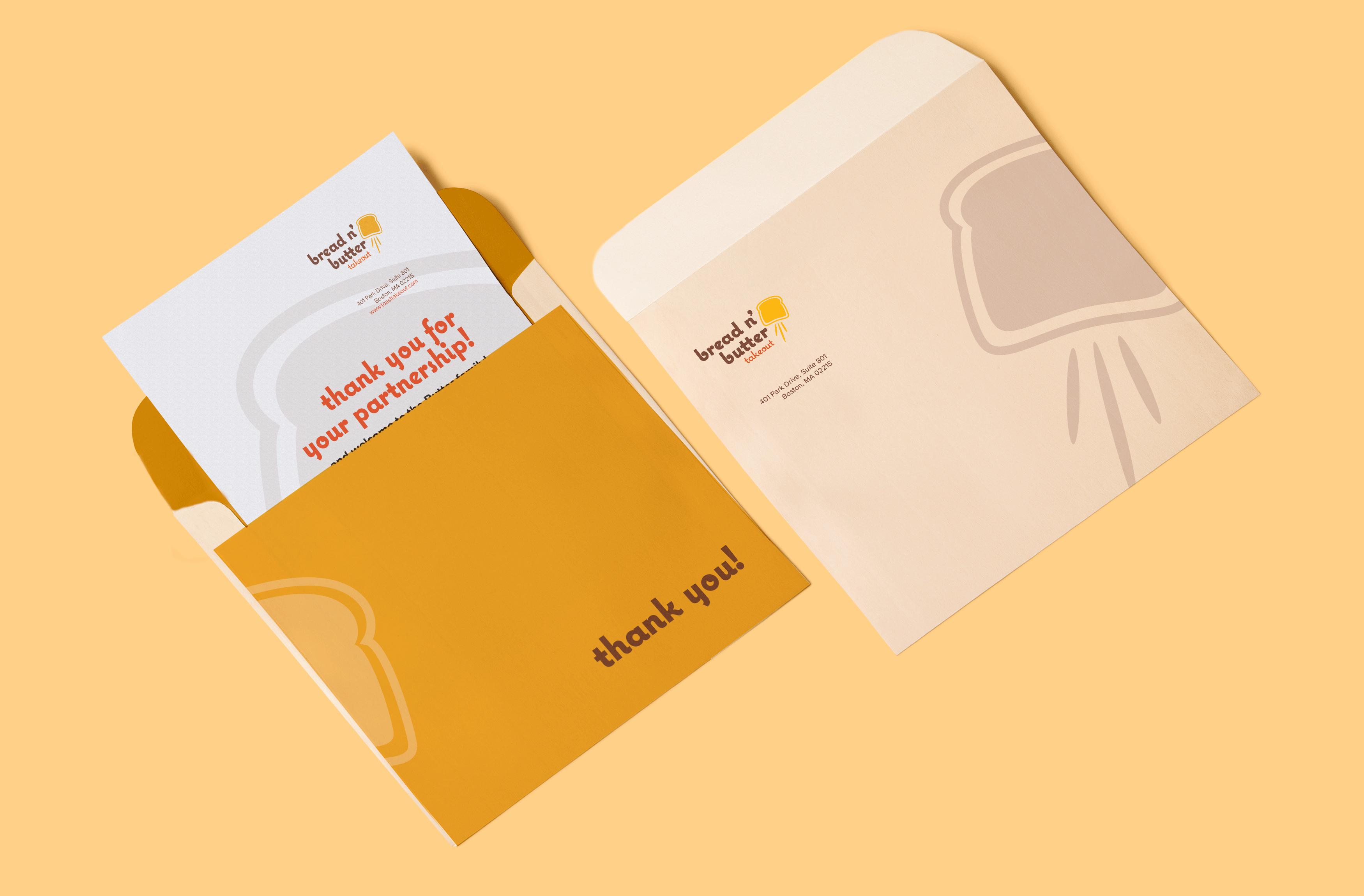
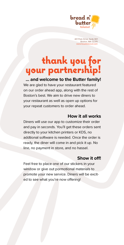
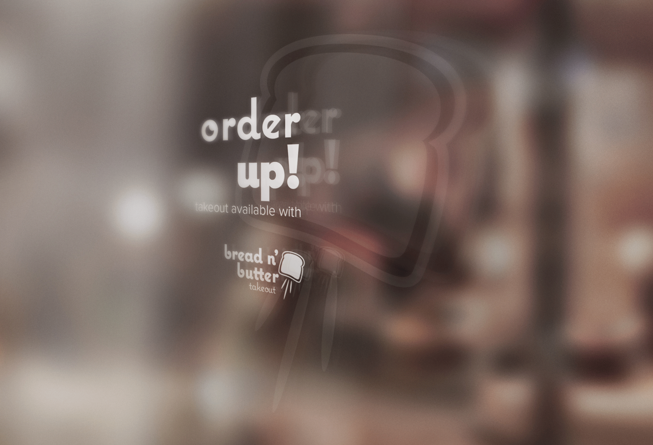
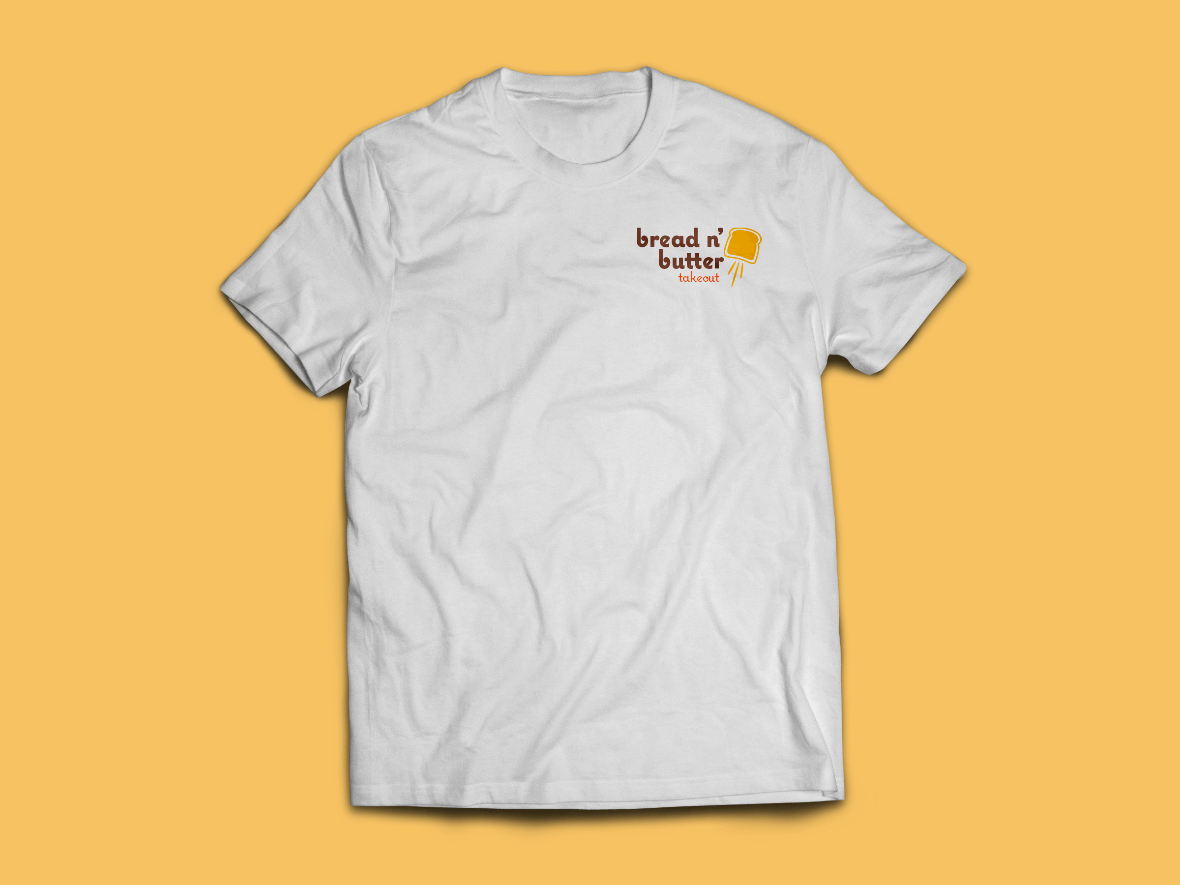
Brand deliverables include: Logo mark, print advertisements, email campaign, a stationery suite, (letterhead, buisiness cards, and envelope), thank you note, window sticker, t-shirt, and takeout bag.
All photography is original.